
Modify Visualizations
Adapt charts and tables in natural language or by editing their options directly.
When Veezoo displays an answer in the chat, you can modify most visualizations by two means:
- By interacting with an LLM model and issuing modification requests in natural language
- By manually editing a visualization's options as a JSON object
The following steps show how to modify a visualization:
- Ask a question
- In the answer, click on the Change Visualization button and choose your desired visualization
- Click again on the Change Visualization and choose Modify Visualization
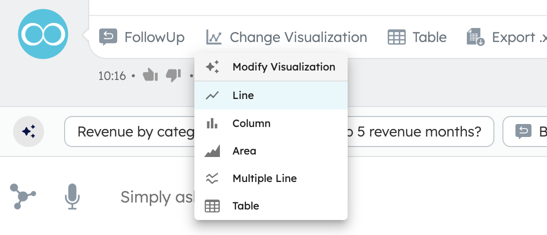
- A text field appears below the visualization where you can enter and submit modification requests to adapt the visualization to your liking

- Use the Edit options button inside the text field to make manual adjustments to the visualization's options
- You can always discard the last modification by going back to the previous state. Once satisfied, you can accept the changes

Charts
Chart Example
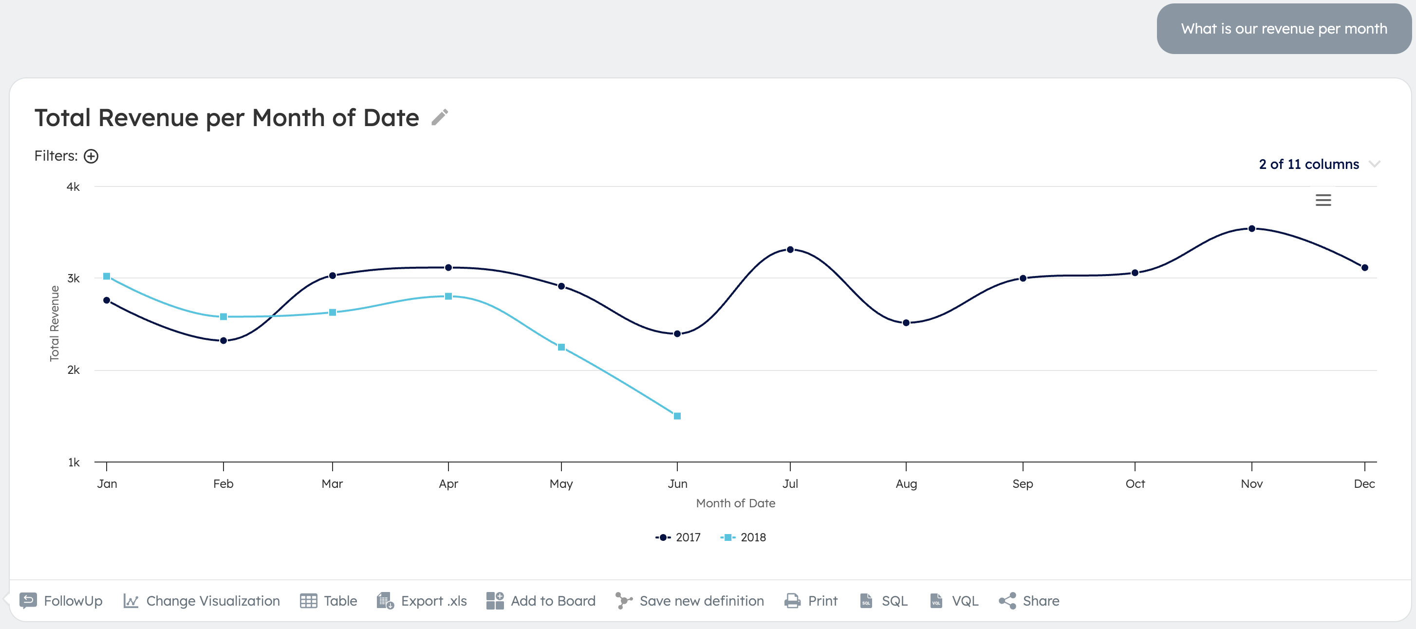
The following shows an example of what a modification of a chart visualization might look like:
- Before:
- Prompts:
- "add a green target line at 3.75k"
- "make the lines red"
- After:
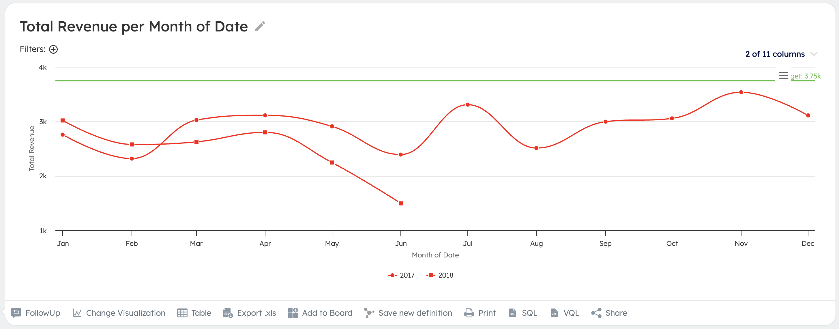
Chart Options
The chart visualizations are based on the Highcharts library. Their options are documented on the following page:
https://api.highcharts.com/highcharts/plotOptions
Tables
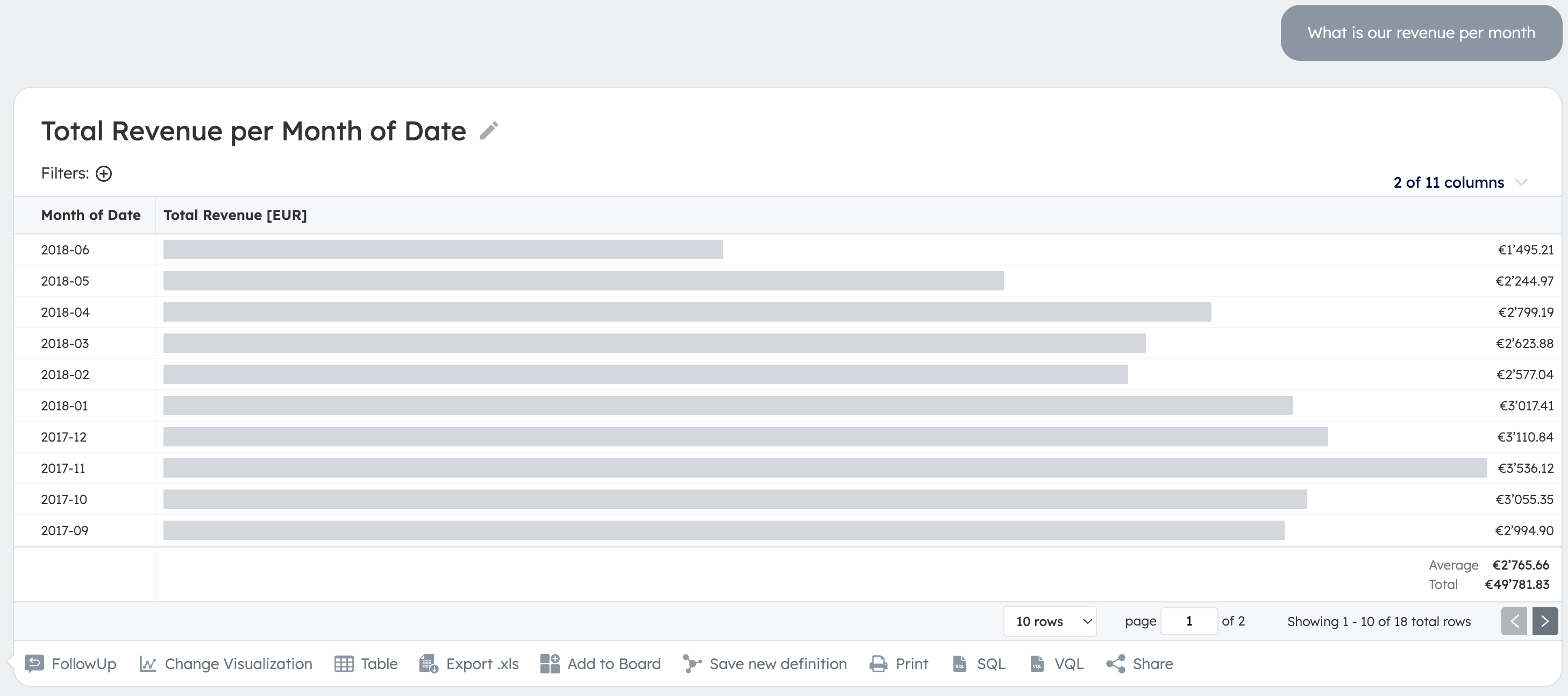
The following shows an example of what a modification of a table visualization might look like:
Table Example
- Before:
- Prompts:
- "make the revenue cells a green heat map"
- "remove the bars"
- "format the dates like June 2018 etc"
- After:
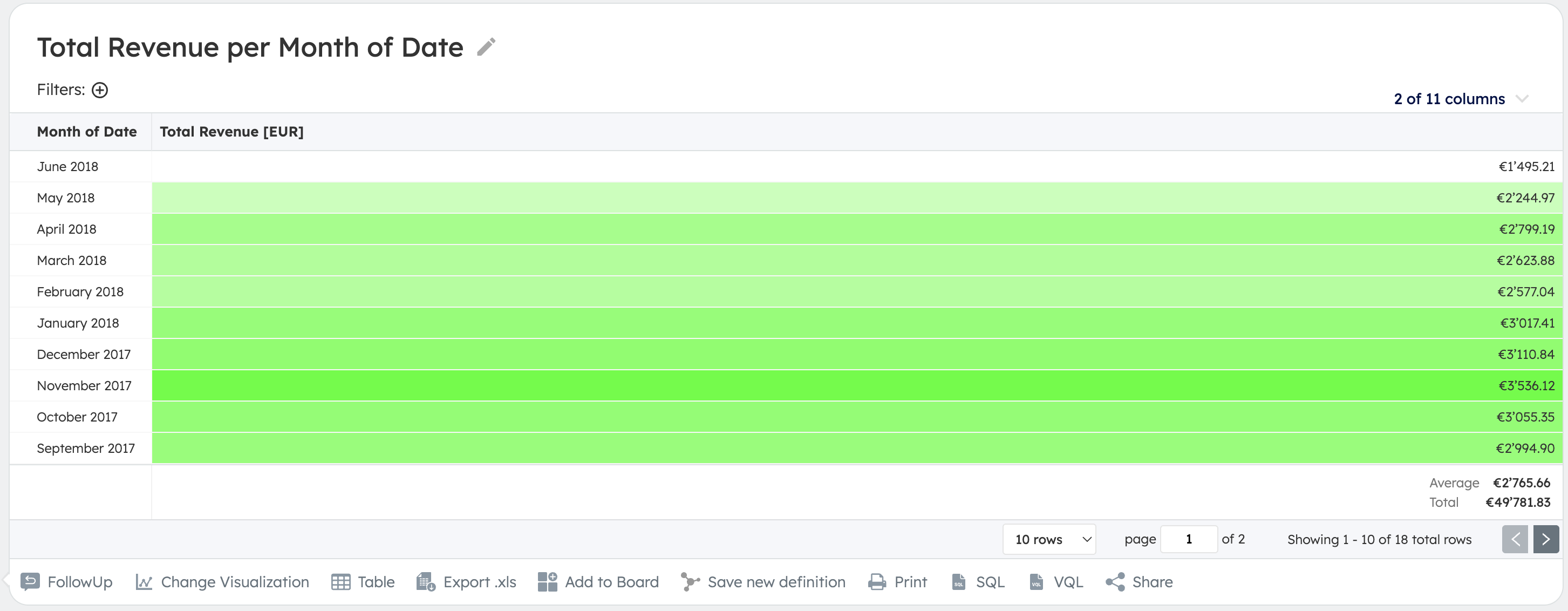
Table Options
The table visualizations are based on the following proprietary configuration format:
| Property | Description |
|---|---|
columns | The ordered list of columns |
columns[*].id | The identifier of the column (cannot be changed) |
columns[*].type | The type of the column, such as number, string, datetime, categorical etc. (cannot be changed) |
columns[*].title | The title of the column |
columns[*].htmlTemplate | The Liquid HTML template defining how the column's values are rendered |
columns[*].cellBackgroundColorTemplate | The Liquid template defining the CSS background-color property of the column's table cells |
columns[*].isHidden | Specifies whether the column is hidden |
columns[*].disableBars | Specifies whether to disable (hide) the bars (with width correlating to the cell value) rendered by default in cells of number columns |
columns[*].disableStatisticsFooter | Specifies whether to disable (hide) the column footer containing statistics (e.g. average and total) rendered by default for number columns |